

From the Open-Publishing Calendar
From the Open-Publishing Newswire
Indybay Feature
Indybay Website Updates
The San Francisco Bay Area IMC (Indybay) collective is, and has always been, 100% volunteer. The collective builds and maintains the custom software that has run Indybay.org since it first went online in the year 2000.
This page is for announcing updates to the website. We encourage site readers and contributors — those who publish to Indybay — to offer feedback on recent updates and contribute ideas for future improvements in the comments below. While we may not incorporate all suggestions into the website, we promise to read and consider each one.
This is not a comprehensive list of updates. Feel free to add your comments below.
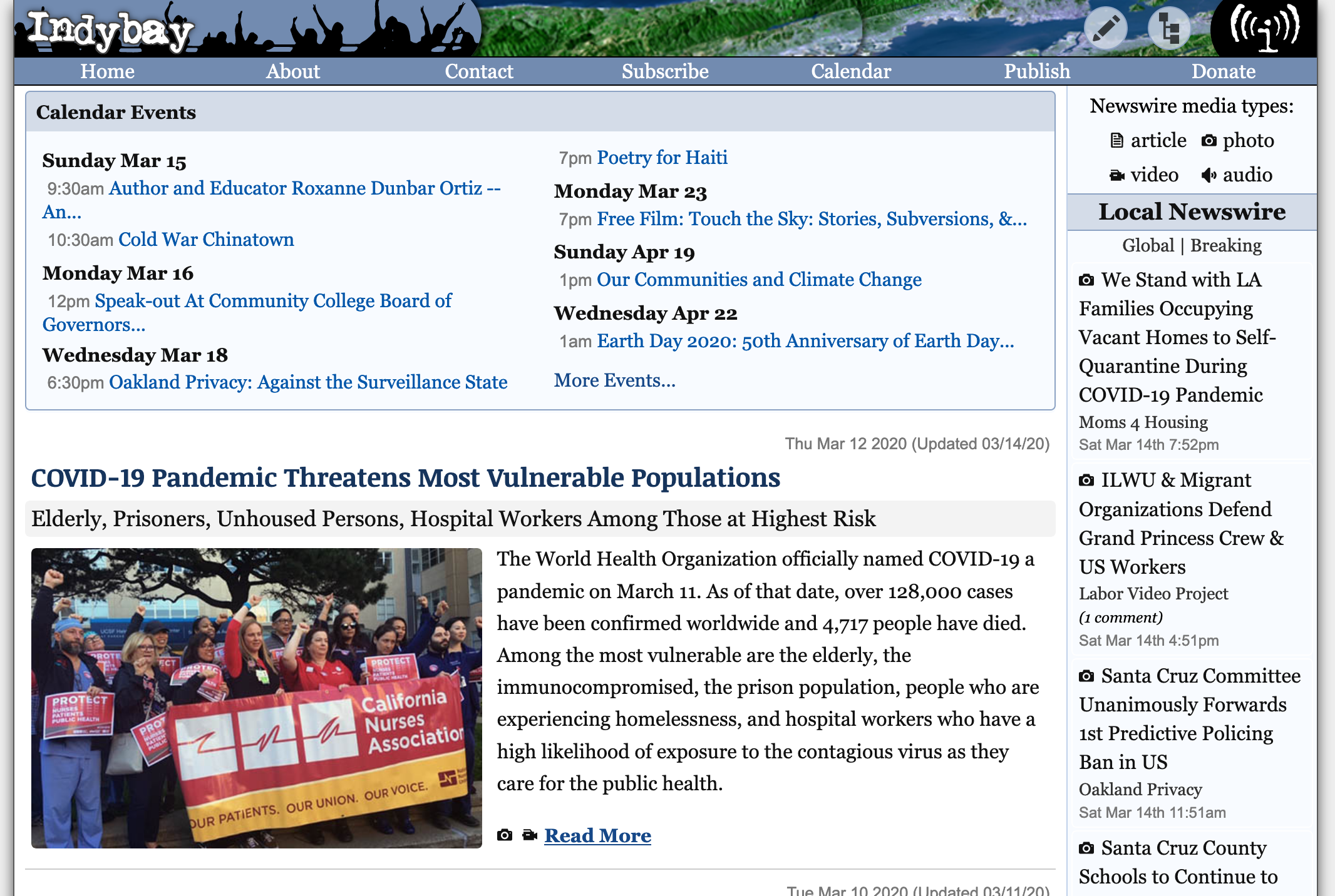
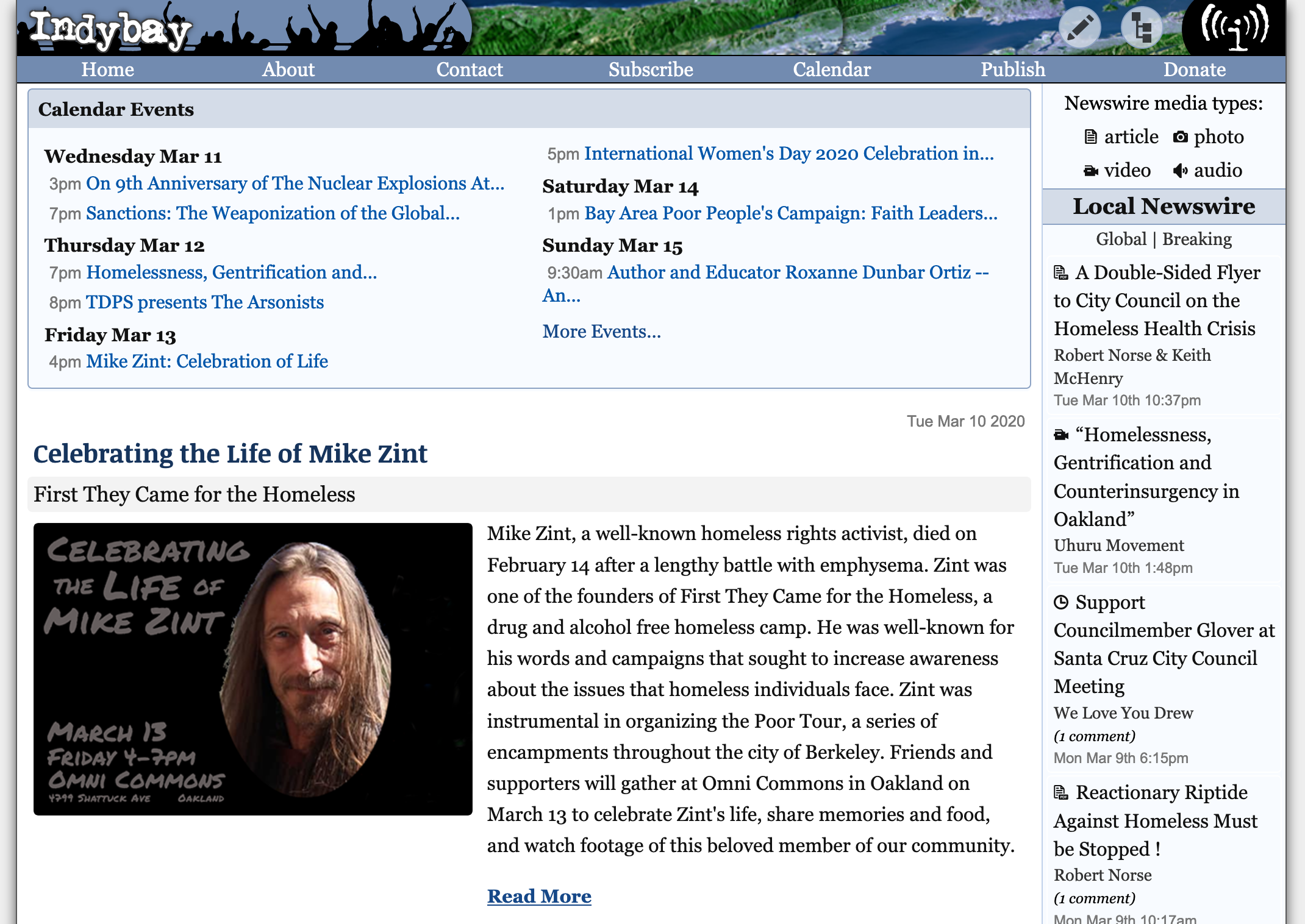
2020/3/10 — New header navigation menus added to allow one-click access from every page on the site to the newswire and calendar publish pages, as well as Topic and Region feature pages. Image size for features increased. Goodbye calendar red links, hello increased consistency with website elements taking on more modular look. Square corners largely abandoned for rounded corners. Old timey red GIF bitmap media icons replaced with cleaner black SVG vector icons.
Before
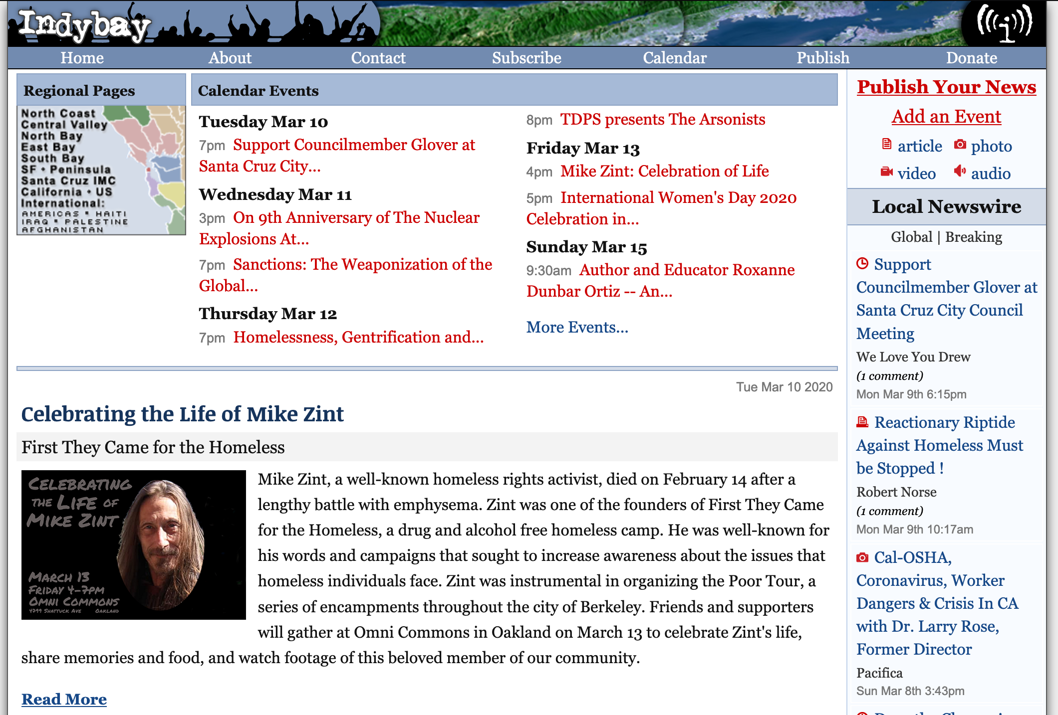
After
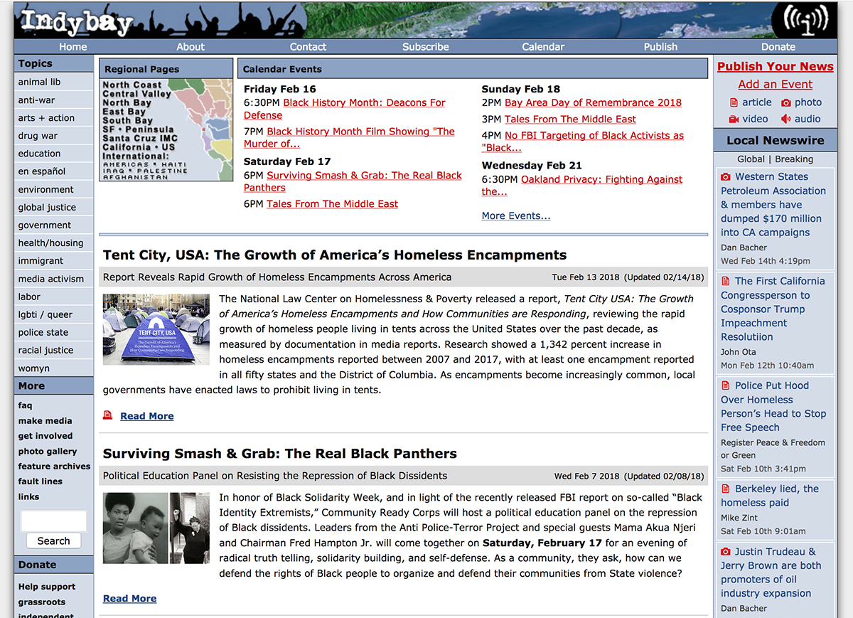
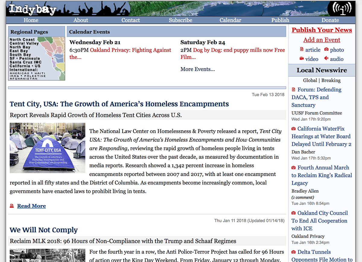
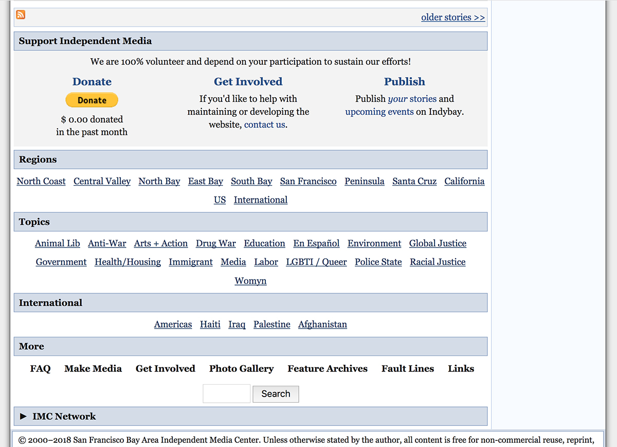
2018/2/21 — On desktop version of website, left column category links moved to the bottom of all pages, making room for more news content higher up. Fonts changed sitewide from sans-serif to serif to improve readablility.
Before
After
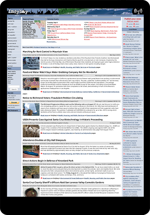
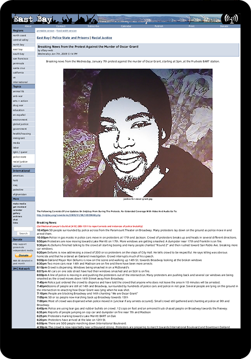
2016/4/16 — Indybay.org goes responsive, meaning that the site is redesigned for compatibility with mobile devices. Desktop version underwent some improvements, but appeared largely the same.
Previously, this is how the site looked on mobile devices:
Check out the early History of Indymedia and Indybay.
This is not a comprehensive list of updates. Feel free to add your comments below.
2020/3/10 — New header navigation menus added to allow one-click access from every page on the site to the newswire and calendar publish pages, as well as Topic and Region feature pages. Image size for features increased. Goodbye calendar red links, hello increased consistency with website elements taking on more modular look. Square corners largely abandoned for rounded corners. Old timey red GIF bitmap media icons replaced with cleaner black SVG vector icons.
Before
After
2018/2/21 — On desktop version of website, left column category links moved to the bottom of all pages, making room for more news content higher up. Fonts changed sitewide from sans-serif to serif to improve readablility.
Before
After
2016/4/16 — Indybay.org goes responsive, meaning that the site is redesigned for compatibility with mobile devices. Desktop version underwent some improvements, but appeared largely the same.
Previously, this is how the site looked on mobile devices:
Check out the early History of Indymedia and Indybay.
For more information:
https://www.indybay.org/
Add Your Comments
Comments
(Hide Comments)
I appreciate the attempt at making more room for news on the page by moving the left column items to the bottom, but so far it doesn't really work: Instead of having text in the left and right columns on the homepage, all the way to the margins of the screen, now there is a lot of blank space where the columns used to be, and the space in the middle is pushed closer together, with less space, rather than more.
News stories are also more compressed, with more empty space, and less room for text. In addition to the empty margins at the edge of the screen, there now is empty margin space around the actual news item. This is not the way it looks in the preview window when publishing however, so we no longer see what the news item is going to look like when posted. The preview version looks much nicer.
The entire bottom section that used to be in the left margin is placed immediately under the news story, not offset with different margins, like the copyright notice below it, so has much less obvious separation from the news story, causing some confusion about whether those links are part of the story or not.
One of the things I've always appreciated about Indybay is that you didn't waste space. The entire screen was utilized with information, but it was never cluttered. It was clean, with an easy overview of what was there. But the way it is now, it looks like you're mostly catering to mobile phones, where people scroll down endlessly along a narrow page. Many people will never even see the bottom of the page, and the links there, the way it is set up now. Maybe it looks great on a phone, but on a computer the narrow page surrounded by massive margins leaves almost half the page empty and wasted. It also makes long articles look much longer, because they are compressed in such a small narrow space.
It looks like these issues could be easily fixed by simply adjusting all the margins to be much smaller.
We are 100% volunteer and depend on your participation to sustain our efforts!
Donate

$260.00 donated
in the past month
Get Involved
If you'd like to help with maintaining or developing the website, contact us.
Publish
Publish your stories and upcoming events on Indybay.
Topics
More
Search Indybay's Archives
Advanced Search
►
▼
IMC Network